| Home | Revision | GCSE | Statistics | Pie Charts |
Pie Charts
Children love pie charts, especially the 3D type produced by Excel etc. Unfortunately they tend to misunderstand the point of a pie chart in that it is used to try and show relative proportions, not frequencies!
The usual mistake with pie charts is not to provide any information showing what the whole pie chart represents, or what the individual slices represent. Without this information it is impossible to compare pie charts in a quantitative way.
When constructing a pie chart we need to work out fractions. We could have a fraction of 360 degrees (or a fraction of 100% if a percentage pie chart is used).
The fraction is the Value / Total
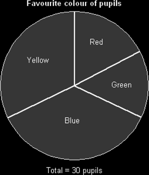
Here is an example of how to construct a pie chart. Thirty children were asked to choose their favourite colour from a list of alternatives. Here are the (made up) results:
| Colour | Frequency | Size of Angle |
|---|---|---|
| Red | 6 | 6/30 x 360 = 72 |
| Green | 4 | 4/30 x 360 = 48 |
| Blue | 11 | 11/30 x 360 = 132 |
| Yellow | 9 | 9/30 x 360 = 108 |
| Total | 30 | Total = 360 degrees |
When constructing the pie chart it is probably best to draw the first line as a vertical radius from the center upwards and to measure the first angle in a clockwise direction from this. The second angle is then measured from this new line, not from the original vertical line. Remember you don't need to measure the last section of pie, though it is a useful check.
Often pupils like to colour in the pieces of pie, but this can look garish, especially if printed off from Excel or OpenOffice.
It can also be beneficial to show either percentages, the actual values or degrees for each sector, but only if this won't clutter the chart.