| Home | Revision | GCSE | Statistics | Pictograms Or Pictographs |
Pictograms Or Pictographs
Pictograms are a basic way of showing frequency data, especially for categorical items. This means that we are dealing with categories such as colour, or type of object rather than numerical data. The main point is that there must be a key that shows how many of the item a particular symbol represents. This should be clearly identified. It is also common to use a fraction of the symbol to represent lesser frequencies. This can lead to confusion, especially if non-obvious fractions are used (as below).
Here is a pictogram that shows the distribution of shoe size in Year 8 (Of course shoe size could be considered to be discrete data as well.) Clearly the modal category is shoe size 7. A shop would want to stock more of this size than any other.
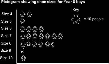
We can see that for shoe size 8 there are five complete symbols and a half symbol. From this we estimate that there were 55 year 8 boys who have shoe size 6.
If the fraction is not an obvious fraction of the key symbol then we must use our judgment. For instance on the row for shoe size 9 we can see that there is only a part of a figure. Perhaps this represents just two or three shoes. Let's say 3 shoes. So number of boys with shoe size 9 is 3.
Here is a frequency table that shows the information in the pictogram.
| Shoe Size | No. of Y8 Boys |
|---|---|
| 5 | 20 |
| 6 | 10 |
| 7 | 70 |
| 8 | 55 |
| 9 | 3 |
| 10 | 10 |
| Total | 168 |