| Home | Revision | GCSE | Statistics | Line Graphs |
Line Graphs
It is vital to make clear that line graphs are NOT the same as bar charts. They do not show frequency based data, but show how one quantity varies for changes in another value. The thing that is changed by the experimenter is called the independent (or explanatory) variable, the thing that changes as a result is called the dependent (or response) variable (because it depends on the thing being changed).
Typical examples are found in science and geography especially. Students find it hard not to use a bar chart for everything!
Usually the independent variable is continuous and it is therefore proper to join the data points by a smoothly changing curve. If the independent variable is discrete then just the actual data points should be drawn and no curve or line should really be drawn between them. This is to stop users of the data thinking that they can interpolate information from the graph! (Interpolation means to get values from between given values by estimating or more mathematical methods. Extrapolation is estimating values from beyond the given data.)
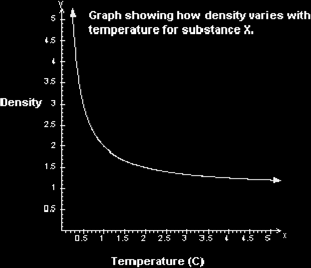
The graph below shows a typical (and made up) line graph. Normally, the arrows on the end would not be drawn, but I wanted to show you that the graph can actually continue on in either direction.