| Home | Revision | GCSE | Statistics | Histograms |
Histograms
Histograms
Histograms are similar to bar charts in that they show frequency, but this time of continuous (or measured) data. As such they are drawn differently. The main thing is to note that the horizontal axis is a scale rather than just labels for categories or class intervals. You will also see that a histogram does not have gaps between the bars.
Some people tend to consider a histogram to be such only if the class intervals are of different widths. If the class widths are the same they consider them to be bar charts. I prefer to use the word histogram for continuous data bar charts regardless.
It is also important to note that if the class intervals are of unequal size, then a frequency density has to be calculated and
This is plotted on the vertical axis rather than frequency. This is because it is the area of the bar that represents the frequency rather than its height! The reason for this is that if we simply plot the frequency, then the area tends to be exaggerated more than the height and this tends to give a false impression as to the relative size of the data represented.
It isn't hard to calculate frequency density - we just divide the frequency by the class-width. (I find that I best remember this by remembering that the frequency is an area and so are the base times height of the bar, which is the class width multiplied by the frequency density.)
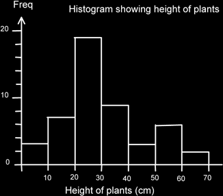
Here is an equal class width histogram showing the heights of plants in a garden. Since the class widths are equal I can plot frequency. Note the scale at the bottom and that the units are stated.
Here is an example of an unequal width histogram. The first one (on the left) is drawn correctly using frequency density, and the one on the right is drawn incorrectly using frequency so that you can see how it over-emphasises the frequencies. I have also included the original frequency table.
| Height of plants h (cm) | Frequency | Frequency Density |
|---|---|---|
| 0 ≤ h ≤ 20 | 8 | 8/20 = 0.4 |
| 20 < h ≤ 30 | 20 | 20/10 = 2 |
| 30 < h ≤ 40 | 15 | 15/10 = 1.5 |
| 40 < h ≤ 60 | 12 | 12/20 = 0.6 |
| 60 < h ≤ 100 | 10 | 10/40 = 0.25 |
| Total | 65 |
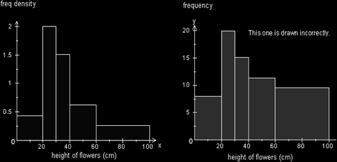
Quite clearly the extreme large area from 60-100 gives the impression that there is a lot of data in that portion, whereas it is actually quite sparsely populated.