| Home | Revision | GCSE | Statistics | Grouped Discrete Data Bar Chart |
Grouped Discrete Data Bar Chart
Grouped Discrete Data Bar Chart
Sometimes, when working with some datasets where a value is counted (i.e. discrete data), we have a problem if we use each data value as a category. For instance if we were counting the number of apples on a tree we might get a different value for each tree. If we had 100 trees we might need a bar chart with one hundred labels if each tree had a different number of apples on it!
In such cases it is better to group the data into intervals or partitions. Such a partition is called a class interval. It is important to note that the data must not overlap. So we can't have an interval from 0 - 10 and then from 10- 20, because into which class would we put the number 10? So we break it up so that we have 0-9 and 10-19, or we could do 0-10, 11-20 for instance.
We do (usually) want to try and make the class intervals exactly the same width, although we might have to make the first or last one slightly larger. So for instance if we used 0 - 10, 11 - 20 etc. then the first interval is 11 numbers wide, and the rest are 10 numbers wide. This may be relevant or important in later calculations!
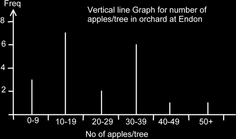
Here is an example of a frequency table showing the number of apples on a tree.
| No. of apples / tree | Frequency |
|---|---|
| 0 - 9 | 3 |
| 10 - 19 | 7 |
| 20 - 29 | 2 |
| 30 - 39 | 6 |
| 40 - 49 | 1 |
| 50+ | 1 |
| Total | 20 |
We can now construct a bar chart as before. Again, note the gaps and note how the class intervals are used as labels, rather than as a scale. There is a heading showing clearly what the graph is about. (Although it could be argued that more information is really required to make it specific as to which orchard, what date etc.?)
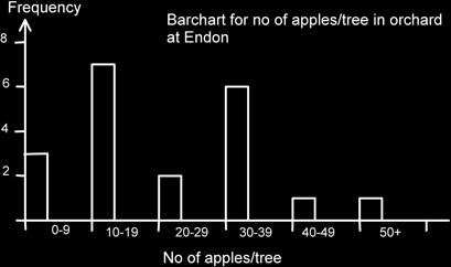
The mode is now known as the modal class and in this case is 10-19 apples/tree. Note also that pupils tend to want to colour in each bar in a separate colour. This isn’t usually appropriate and tends to look unprofessional! It doesn’t matter where the bar actually starts, though I personally tend to start at the left most part of the class and go about a third to half way across. What does tend to look tacky is when only a very narrow space is left. Bar charts have gaps; make sure it is clear that they do.
Note how the class intervals are acting as a label for each bar. The bottom axis is not a scale.
When doing calculations from grouped data frequency tables remember that unless we have the original data we would estimate the mean etc. by using the middle of the class interval. (See the chapter on analyzing data for more details.)
We could, of course, have replaced the bar chart by a vertical line graph: