| Home | Revision | GCSE | Statistics | Frequency Polygons |
Frequency Polygons
Frequency Polygons for Grouped Continuous Data
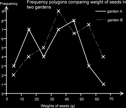
If we want to show the data from two datasets on the same graph for comparison purposes we can use a frequency polygon. We could use two (or more bars) on the same graph, keep them narrow and use different colours, but often it is hard to read the graph and get an overall impression. We cannot use a histogram for this purpose. Sometimes you might see the bar chart turned so that the bars are horizontal and then the two sets of data are shown on opposite sides of a vertical axis, but again these tend to be difficult to interpret - though they might look pretty!
A frequency polygon joins the mid-points of the tops of the bars in a histogram. The main teaching point is that the lines should be straight, not curved.
[In the past it was felt reasonable to use a frequency polygon for discrete data also, but to use a dashed line to link the points instead of a solid one. The dashed line indicated that data could not be interpolated, that is no intermediate values could be obtained. Now a vertical line graph is used for discrete data.
Personally, if I were comparing two datasets of discrete data, I would be quite happy to use a frequency chart to show both. It is certainly more effective than vertical lines! However, for the purposes of GCSE do what the examination board say.