| Home | Revision | GCSE | Statistics | Discrete Data |
Discrete And Continuous Data
Discrete Data
For simple discrete data where there are only a few allowable values, such as number of children in a family, or number of passengers in a car, we can use a bar chart or a vertical line graph. The value of the item, e.g. 3 children, is used as a label for the bar or vertical line. Here are examples of both for the frequency table below:
| No. of Children | Frequency |
|---|---|
| 0 | 3 |
| 1 | 5 |
| 2 | 8 |
| 3 | 2 |
| 4 | 1 |
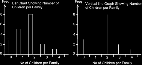
Effectively there is no real difference between the two types of graph. Note, however, that for the vertical graph the lines are drawn in the middle of the width allocated to the label or value. The number of children value is simply acting as a label here.
It is allowable to use a bar chart to show data for two or more situations so that they can be compared, but to my eyes they always look messy.
Continuous Data
The data set shows a group of continuous data.
This data is called continuous because the scale of measurement - distance - has meaning at all points between the numbers given, eg we can travel a distance of 1.2 and 1.8 miles.
Length of journey to workDistance in miles 0.1 0.2 0.6 1.1 1.2 1.8 2.0 2.7 3.4 4.6 6.2 8.0 12.1 14.2