| Home | Revision | GCSE | Statistics | Continuous Data Cumulative Frequency Polygon |
Continuous Data Cumulative Frequency Polygon
Cumulative Frequency Graphs
These graphs are very useful for estimating the median and inter-quartile range of grouped data. The data type can either be simple discrete data, grouped discrete data or continuous data. They can also be useful for comparing distributions.
Continuous Data Cumulative Frequency Polygon
The cumulative frequency graph for continuous data is almost exactly the same as for grouped discrete data. Here is some data collected on the heights of some pupils in a form.
| Height - h (cm) | Freq | Cumulative Frequency |
|---|---|---|
| 120 < h ≤ 130 | 1 | 1 |
| 130 < h ≤ 140 | 4 | 5 |
| 140 < h ≤ 150 | 7 | 12 |
| 150 < h ≤ 160 | 8 | 20 |
| 160 < h ≤ 170 | 4 | 24 |
| 170 < h ≤ 180 | 2 | 26 |
| 26 |
Here is a plot of this data. Note that the upper bound is effectively the top of the class interval.
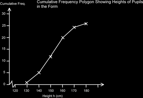
Again, we can use this graph to estimate the median and the quartiles.
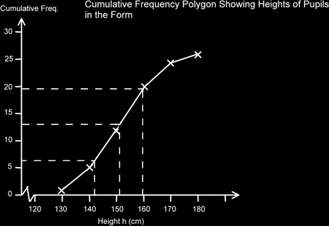
For the median we chose ½ of (26+1) which is 13.5, for Q1 we used ½ of 13.5 which is 6.25 and for Q3 we added these together to get the ¾ point, so 13.5+6.25 = 19.75 (For GCSE Maths you would get away with 13, 6 and 19.)
The median is 151cm, Q1 is 141cm and Q3 is 160. Therefore the Interquartile range is 160-141 = 19cm.
This gives us some indication of the spread or variance of the data. A larger number would indicate that the data is more spread out. This would also be shown on the graph by a less steep curve. It is useful to know this if you plot two datasets on the same graph.
If you do plot two polygons on the same graph, you might find it useful to convert the cumulative frequencies to percentage cumulative frequencies. This is easy to do as is seen below.
| Height - h (cm) | Frequency | Cumulative Frequency | % Cumulative Frequency |
|---|---|---|---|
| 120 < h ≤ 130 | 1 | 1 | 1/26 x 100 = 4% |
| 130 < h ≤ 140 | 4 | 5 | 5/26 x 100 = 19% |
| 140 < h ≤ 150 | 7 | 12 | 12/26 x 100 = 46% |
| 150 < h ≤ 160 | 8 | 20 | 20/26 x 100 = 77% |
| 160 < h ≤ 170 | 4 | 24 | 24/26 x 100 = 92% |
| 170 < h ≤ 180 | 2 | 26 | 26/26 x 100 = 100% |
| 26 | (rounded to nearest whole %) |
The median is now at the 50% mark, Q1 at the 25% and Q3 at the 75% marks. The advantage of this is that it is really easy to compare two datasets that have different number of data items in them.
Often questions are asked about what proportion are less than a certain amount or more than a certain amount. To use the graph to calculate these we draw a dotted line from the horizontal data axis to the curve and then across. If we want the number less
than this amount we can simply read off the value. However if we want the value that is larger than this we need to subtract this value from the total number of items. This is to get the number that are more than the required value.
Cumulative Frequency Curve – The Ogive
If we take the (ac)cumulating process to the extreme, and if we had a large number of data items, we would find that we are getting lines which are closer and closer to each other giving us a curve, rather than a polygon. This S shapes curve is called an ogive, (pronounced oh ghyve, not oh give). We use it in just the same way as a polygon, but of course it will be much more accurate. If you wanted you could connect the points on a cumulative frequency polygon by your own estimated curve, but this is not recommended at GCSE level.