| Home | Revision | GCSE | Statistics | Comparing Data – Scatter Graphs And Line Of Best Fit |
Comparing Data – Scatter Graphs And Line Of Best Fit
It is often the case that we can collect more than piece of data for an item. For instance the classic example is the height and weight of a person. Other examples include the price and age of a car, the age at death and average number of cigarettes smoked by a person, the age and weight of a baby, the number of ice creams sold by an ice-cream van and the outside temperature and so on.
We might sometimes feel that there is a relationship between the two things. We might expect that if a person is taller then they will weigh more, or if a car is old it will be worth less (unless a classic, veteran or vintage car?). Sometimes we might not expect any relationship between the parameters. For instance we might compare a person's mathematics score and the time in which they can run 100m. We might be surprised if there was any relationship here. The classic way of comparing such parameters for an item is to use a scatter graph. In this we have an axis for one parameter (say height) and use the other axis for the other parameter (say weight). For each item we then mark the intersection of their height and weight with a mark, usually a cross, which we call a scatter (point).
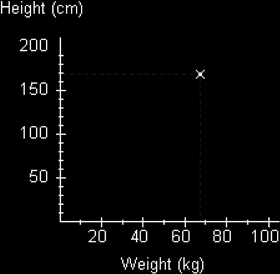
Here we have plotted a scatter for a person who weighs 68kg and has a height of 170cm.
We can now do this for a number of people and get a typical result like the following graph.
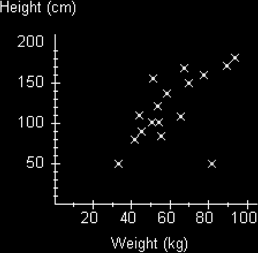
We can see from third diagram that there does seem to be some kind of relationship between the weight and height of people. In general the scatters seem to be going upwards from left to right.
We could write this in words and say:
The greater the weight the greater the height.
We say using technical language that we have a positive correlation.
You should get into the habit of writing statements about relationships in this way. You certainly need to compare the effect of increasing one parameter on the other and using the technical term. Correlation simply means relationship. So a positive correlation simply means we have a positive relationship. We use positive because the trend of the data is in a positive upwards direction - it is just a convention.
We could actually give the impression of this relationship by drawing a line on the graph which not only shows the direction the scatters seem to be forming, but which also try to be an average of the direction the scatters are going in. We call this a line of best fit.
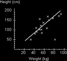
A few things to note about this line. Firstly, it doesn't have to start or seem to come from the origin. In this case we could argue that a person having zero weight would also have zero height, so we could draw the line from the origin. However we have no data points that close to the origin so we have no need to start it that close. The line is also drawn so that it is balancing out the distances of the scatters from the line. A piece of software (such as Excels Trend option) would do this mathematically to get the average distance from the line as low as possible, but we can use our eye and judgment to get the best line possible. Of course this does mean that different people might judge the line differently and get different answers when they use it, but this is taken into account in examinations by allowing a range of acceptable values.
However if we want to locate this line a little more precisely we can mark the double mean point. To do this we work out the mean value of both sets of data and then plot this point, perhaps put a little circle round it to indicate that it is the mean point. Our line of best fit would now go through this point.
Note that we do not draw the line to go too far past the scatters. We could expect the line to follow the same pattern, but really we have no evidence to expect this, so we are cautious. If you do want to draw the line past the scatters then it might be best to use a dashed line to indicate this.
Note also that occasionally we get scatters that seem way off from the usual trend. In this diagram that particular scatter is marked along the bottom to the right. We call this an outlier. (It seems to be a small, but heavy person!) We don't force the line to include this point because it would bias our line. We also seem to have more scatters on one side of the line than on the other. This is okay because some of the scatters on the top of the line are further away from the line than those underneath. We are just trying to get a balanced line.
We can use a line of best fit to work out expected values of one parameter given the other parameter. For instance if I want to know the expected height for someone who weighs 75kg, I could draw a dashed line from this mark on the scale to the line of best fit and then horizontally as shown in the diagram below. Note that we draw to the line, not to a point that might exist.
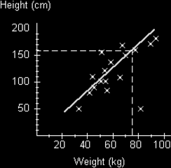
We can see that we get a height of about 160cm. When we draw lines to the line of best fit such that we are inside the range of scatter points we say we are interpolating the results. Remember we are only obtaining an estimate of what we might expect. It isn't guaranteed. We are also only assuming that the relationship does in fact exist - it might not! It also might not be a linear (as shown by a straight line) relationship at all. If we want to try and find an value that is outside the line of best fit, we have to assume that the straight line (linear) relationship continues (though it might not!) and as mentioned we can draw dashed lines to show this. Then we can extrapolate the answer. This of course may well be inaccurate. It is always best to work out values that lie inside the range of scatters than to go beyond. i.e. it is better to interpolate than extrapolate.
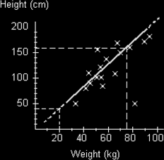
In this example we are extrapolating the weight of a person who is 40cm tall to get a weight of 20kg. Whether this is true is debatable?
Let's now look at the example of the price of a second hand car compared with its age:
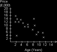
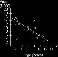
The distribution of scatters seems to be going down from left to right here. We could say, the greater the age of the car the lower the price. This is a negative correlation. If we draw a line of best fit here we would get the following diagram:
Note that the lower left scatter is saying that we have a fairly new car that is quite cheap – it must be a Skoda! (old joke I know.)
Let us now look at the graph we might obtain if we plot the score in a mathematics test against the time for a person to run 100m.
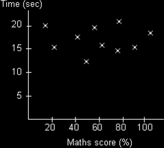
In this case there is no discernible pattern to the scatters. They are all over the place. In this case we say there appears to be no correlation. I cannot and must not draw a line of best fit.
Notice how careful I am with my use of language. I cannot say with any certainty there is definitely no correlation at all, because I do not know that for certain. The data I have so far collected seems to suggest that there is no relationship, but perhaps more data would show a relationship, or perhaps the mathematics test I am using is not powerful enough to reveal the relationship. The same is true if there seems to be a positive or negative correlation. The scatter graph is only suggesting such a relationship. It might also be that any relationship is actually not linear but could be some other relationship such as quadratic, exponential, sinusoidal, or an even more complex function.
Pupils do find it hard to resist drawing a line of best fit even if this is clearly inappropriate - so be careful.
Further mathematical studies will reveal various mathematical techniques that can be used to formalise the use of lines of best fit - regression - and of calculating the degree of correlation by using correlation coefficients.