| Home | Revision | GCSE | Statistics | Categorical Bar Chart And Vertical Line Graph |
Categorical Bar Chart And Vertical Line Graph
Categorical Bar Chart and Vertical Line Graph
This type of chart is used to show the frequency or quantity of some item. For instance, the number of blue cars etc. The individual types of data are called categories. Sometimes the categories could be actual numbers. For instance the number on the face of a dice when thrown.
The key things to consider are that there must be gaps between the bars (no matter what the science and geography departments say!) and those labels should show what each bar represents. The vertical axis represents the frequency.
Here is a typical bar chart that shows the number of each colour of car that passed a school in a 10 minute period.
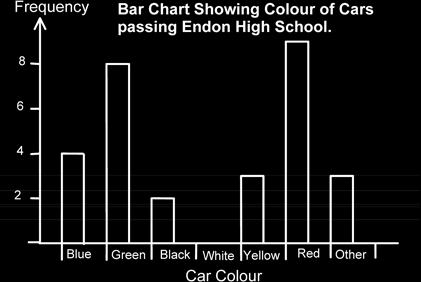
Although it is personal choice, the width of the bars should be about the same size as the gaps or narrower for the best effect.
To make it easier to draw, some people like to use a line-column graph, which is a bar chart with vertical lines instead of bars. Note that the vertical line is drawn in the middle of the category width.
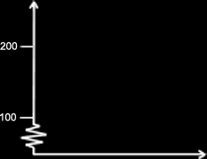
Note also that if the frequency axis doesn’t start from zero it is best to put a little zigzag on the axis to highlight this. This is true for all other types of chart as well.