| Home | Revision | GCSE | Statistics | Box And Whisker Plots |
Box And Whisker Plots
Box and whisker plots are useful in showing at a quick glance the salient features of a distribution of data (dataset) and especially in directly comparing two or more datasets.
There are two types: those that show the median and interquartile range and those that show the mean and standard deviation.
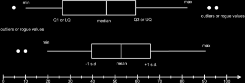
I have shown both types on this diagram although normally we would only use one type in a comparison situation.
The basic features are that we have a line from the minimum point to the first quartile (or the mean - 1 standard deviation) and a line from the third quartile (or mean + 1 standard deviation) to the maximum point. These lines are the whiskers. If there are any obvious outliers or rogue values that do not seem to be part of the normal dataset values we (might) indicate these by using a dot. A box is then drawn and a line to show the median (or mean) value is used to split the box. For median-IQR
box plots the line may divide the box asymmetrically, for the mean-s.d. plot then the mean will split the box into two.
For the median-quartiles type of box plot an outlier or rogue value is defined to be any point that is below the lower quartile - 1.5 times the interquartile range and more than the upper quartile + 1.5 times the upper quartile.
For the mean, standard deviation type I don’t know what the definition is! In fact, it isn’t usual to use a box and whisker for mean/standard deviation, though I’m not sure why (possibly because it doesn’t show skewness.)
As you can see it is very easy to use these diagrams to discuss the spread of data and also its average. The wider the box the more spread out the data.
Box and whisker plots can also be drawn vertically.
For a median – IQR boxplot the skewness of the data can be seen. If the median is closer to Q1 (LQ) than to Q3(UQ) then the skew is positive, otherwise it will be negative, and i.e. the median is closer to the Q3 point (UQ).