| Home | Revision | A-Level | Economics | How Markets Work | The production frontier or production.. |
The production frontier or production possibility curve
What is it?
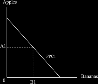
It shows us the maximum that a country can produce. There is clearly a limit to this at any one time just like there is a limit to the weight that you can lift over your head or eat at any time. We assume two goods (I will use apples and bananas as these easily can be represented by A and B) for ease of explanation – but it is true of any number of goods.Drawing the diagram – we start with the maximum amount of good A we can produce if all our resources are devoted to producing A which gives us a point on the vertical axis; then we do the same for the case if we only produce B to give us a point on the horizontal axis. Then we join the two positions with a straight line. Once we have drawn the line, we do not have to have all apples or all bananas but we can chose some- where along it. Any point on it represents a mix of the two goods that people wish to buy. At the point se- lected above, people consume 0A1 apples and 0B1 Bananas.
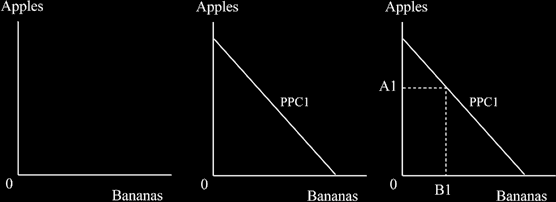
You should practise drawing all the diagrams regularly – several times each day is a good idea. In the end, they need to be second nature to you so that you can recall and correctly draw the appropriate diagram whenever you want. It is most important to be able to this so that you can quickly gain good marks. The wrong diagram, a mislabelled one, or one lacking labels, more or less dooms you to fail. It shows that you do not really understand what you are saying and examiners hate that. Labels, by the way, are the words on the diagram, like “apples”, “bananas” or “ppc 1” in this diagram.
When tutoring, I would draw each diagram again in front of the student, and explain the importance of get- ting it right (and remind them of this now and then later). It is important to see how a diagram is built up as they are really easy to do, but to be suddenly presented with a complicated finished product can be a bit daunting. For this reason, I have put in a sensible order of drawing the diagram for the first few times I present them. It is just about impossible to get a good mark in economics without drawing diagrams, so start practicing without delay!
Warning! It may seem easy, but it helps you much less if you download diagrams from the Internet and paste them into essays. It is more valuable for you to draw them, and learn them, for yourself. END OF DIGRES-
SION]
The way the diagram of the production possibility curve is drawn.
We usually draw the production function curved , to reflect the law of diminishing returns. Some factors of production are better at producing A and not as good at B, as you might imagine. Some land is simply bet- ter at growing bananas than apples, just as some of your friends are better at doing maths, swimming or playing the guitar than others. So as we move down the production possibility curve and get more bananas, we can expect to get a few less bananas than we might expect; perhaps we used to give up 5 apples to get 5 more bananas, but as we slide down the curve we will get, say, only 4 more bananas, then only 3 more, or 2 more, as we keep sliding down.
The line curves in at each end to show this as in the diagram below.
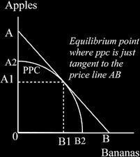
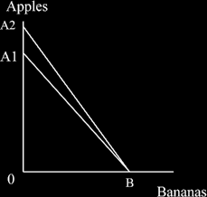
[Digression. It is unlikely in my view that you will be asked why the production frontier is curved as op- posed to a straight line, but if you do, the reasoning above and the diagram explains it. In the diagram you can easily see that if we had a straight line production possibility curve (like AB) we could produce the max- imum amount of apples at the end of it, that is, at A, and have no bananas at all. But as diminishing returns do exist, we are actually on the curved A2B2. The maximum apples possible are at A2 (not A which we could reach if we were on the straight line ppc ). As diminishing returns put us on the curve not the straight, the difference between A2 and A is the quantity of apples lost because of diminishing returns, End of digres- sion]
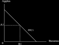
It is common to use straight line production frontiers in text books because they are easier to draw and ma- nipulate, so they often look like the diagram below.
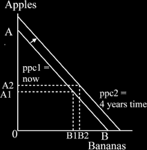
What happens if we swivel the curve? If society learns to get better at producing Apples alone, it would swivel the curve out along the vertical axis of apples. This reflects the fact that we can get more output from the resources and factors of production that we have. The swivel that gives us more apples reflects a productivity increase in apples, but not in bananas.
After the productivity increase in the apple growing industry, withe same quantity and quality of factors of production, society can increase the output of apples from 0A1 to 0A2, that is, by the distance A1 to A2.
If we swivel it the other way, and push out B , we would get a productivity increase in bananas, but not in apples.
What if we move the whole curve out? If a country has learned to get better at producing every- thing, this would physically move the production frontier upwards and outward, which is economic growth.
We return to the subject of economic growth in the unit “Managing the economy”.