| Home | Revision | A-Level | Economics | How Markets Work | Demand and supply: An introduction |
Demand and supply: An introduction
(Abbreviations: S = “supply”; D = “demand”; Y = “income”; r = “rate of interest”)
At the equilibrium price, the quantity demanded just equals the quantity supplied. There are unsatisfied con- sumers who could not buy at that price even though they were willing. What do we mean by equilibrium? Equilibrium is the state of affairs in which there is no tendency to change. How do we show this equilibrium price? We use demand and supply curves.
Demand
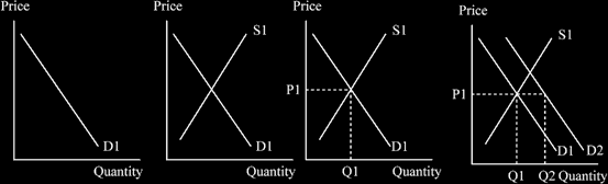
What is the demand curve? It is a curve showing the quantity that will be bought on the market at different prices.
The lower the price, the more will be demanded; the higher the price the less will be demanded. Think! If all Nike trainers were £2 a pair, would you buy more than if they were £200 a pair? It seems probable!
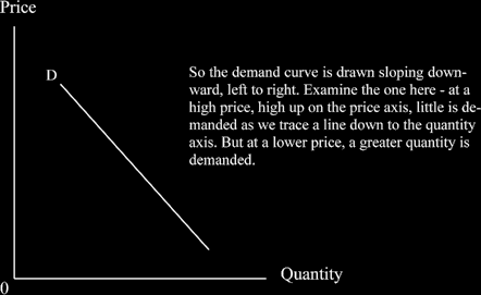
In economics, “demand” means demand is backed by money – it is not just a need or a desire, but people do have the money to buy and are prepared to buy.
Supply
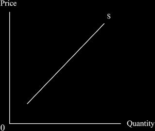
What is the supply curve? The supply curve is a curve showing the quantity that will be offered on the mar- ket at different prices. We believe that higher prices cause more people to sell. Imagine: in your classroom,
if I offer to buy each T shirt for £500, almost everyone will sell to me; but if I offer £1 each, probably few if any would be willing If however I were to offer £7, more would sell but probably not everyone. That is why the supply curve slopes upward.
Let’s put both the demand and supply curves on the same diagram .
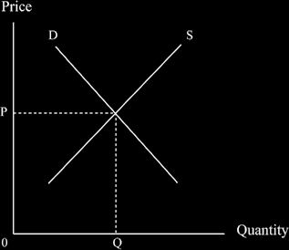
Guess where the equilibrium price will be? Right! Where the two curves cross! As said earlier, at the equi- librium price, the quantity demanded just equals the quantity supplied. There are no unsatisfied consumers who could not buy at that price even though they were willing and everyone who wanted to sell at that price could do so. This happy situation happens at the intersection of D and S with price P and quantity Q.
When I started in economics, I had to chant along with the rest of the class: "price is determined by supply and demand!” It certainly made it stick in my mind and might help you too!
Let us return and look at demand in more detail (We’ll look at supply later too)
What determines the D curve?i.e., why is it where it is and not somewhere else?
1. There are four main personal determinants of demand
· Income
· Taste
· Prices of other goods or service
· Expectations about future prices of this good or service
2. AND several other market determinants
· Income distribution - if you think of all the other people in your house and you as you are now, then if you suddenly got all the total income and savings and the others had none, there would be a dif- ferent pattern of demand from what it is now. They probably do not eat lunch every day if they have no money. It is the same in society in general: change the income distribution and a new pattern of demand curves follows.
· Wealth distribution (as opposed to income distribution). If 10% of the population have 90% of the wealth, probably more Porsche motor cars will be demanded than if we all have the same rather lowish amount!
· Population size - the larger the population, the bigger the demand, ceteris paribus. That is a Lat- in tag meaning “all other things remaining the same” and you might come across it in a lot of eco- nomics books.
· Population age distribution - if there are many old people, important demands in society will be for medicines, hip replacement operations and Zimmer frames but fewer Beastie Boys CDs, or prams.
· The interest rate. This is especially important for house purchases, motor cars, long-life consumer goods often on a credit card, or hire purchase generally. A higher rate of interest means more to re- pay, so people tend to borrow less.
What can cause a shift in the demand curve? (= a new curve)
A change in any of the above determinants of demand will do it!
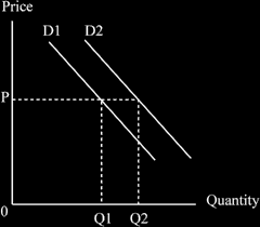
If demand increases, overall, more of the good/service is bought at any unchanged (the same) price. You can see this in the diagram below, where at P1 an amount OQ1 is demanded, but after demand increases to D2,
at the same price an large amount is demanded, i.e., OQ2. It is easy to remember what “an increase in de- mand” means; there must be a new curve and it will move upwards and to the right.
The effects of an increase in demand are usually analysed using the equilibrium positions determined by the intersection of demand and supply.
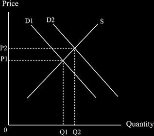
You can see that the increase in demand means we move from the equilibrium position P1Q1 to the new equilibrium position P2Q2. More is demanded - we shift from the position Q1 to the position Q2, so the dif- ference (OQ2 minus OQ1) is Q1Q2.
The way the diagram of a shift in demand is drawn,(shown not moving to the new equilibrium, so you can see that more is demanded at the same price)
The way the diagrams are built up should be reasonably clear by now. If you have any worries, check back and examine those supplied earlier. The general principles are:
1. Draw the axes and label them immediately (“one axis, two axes”).
2. Put in the first curve and label it.
3. Add the second curve and label it.
4. Draw the equilibrium position – preferably using dotted lines.
5. Make the necessary changes, such as shift a curve inwards or outwards by drawing a new curve and la- belling it.
6. Draw the new equilibrium position – preferably using dotted lines.
7. And finally you compare the new equilibrium position with the first one, using your own words but trying to get in the necessary jargon phrases such as “increase in demand”, or “economic growth”, whatever is relevant to the question you are tackling.
Henceforth I shall not be supplying the series of pictures showing how the diagrams are built up, as you should be able to follow the above principles for yourself. Before long, it will become second nature to ex-amine a finished diagram and work out how it was built up.
If demand decreases, the demand curve shifts the other way, downward and to the left. Again we have a new curve, as in the diagram below.

You will notice that less is bought at any given price, such as P.
Again, a decrease in demand is usually analysed by determining the new equilibrium position and the com- paring it with the original one. For this we need to put the supply curve in.
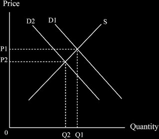
As you can see, if demand decreases, then less is bought (as you might imagine!) and the quantity demanded falls from Q2 to Q1; price also falls, in this case from P1 to P2
Let us look at supply in more detail
What determines the supply curve, i.e. why is it where it is and not somewhere else?
The answer is, the price, quantity, and quality of inputs used. These consist of things like machinery, equipment, staff and workers, raw materials, and fuel. These are collectively known as “the factors of production”, and are often summarised as land, (L) labour (N) and capital (K) plus a remainder term, R.
· Land - is what it says but can include things like diamonds or oil that are found there.
· Labour mostly means workers, but also includes managers.
· Capital means machinery and equipment. A subset of this is“social overhead capital” - like roads, bridges and docks.
[Digression: The whole production of the nation can be summed up as: O = f(L, N, K) + R
or put into words, “output is a function of (= is in some as yet undefined way caused by) land, labour, capi- tal, and a few other things”. You will need this later; I am just sowing a few seeds.]
· The remainder term “R”, which covers things in both labour and capital is the really interesting one
The labour component of “R”. This consists of things like entrepreneurial ability, the managerial methods in use, labour motivation and how good it is, labour skills, the strength of the trade union and its attitudes, the bonus and other incentive systems in force, the quality of the education system, and the retraining facilities available in society.
The capital component of “R”. This consists of things like:
The level of technology, knowledge about what technology is available, the adequacy of factory organi- sation, and economies of scale. They can obviously affect the supply curve, or the output possible, if they are good or bad.
· Maybe the weather, e.g. floods can destroy crops, effect transport, reduce supply, and raise price.
· Joint supply - if we increase the number of sheep to supply an increased demand for mutton, it auto- matically increases the wool supply. So the price of related good can be a determinant of supply. Examiners like questions on joint supply, but it is not often encountered in the world in which we live.
· The productivity of the factors of production – this is closely related to technology; but it can also be how hard workers are prepared to work, motivation, and incentives systems etc. (it too can appear separately, or be included in the remainder term, R, as above).
· The size and number of firms in the industry, including the marketing conditions.
· War and social unrest.
What can cause an increase or decrease in supply?(a shift in the curve)
Like demand, it needs a change in one or more of the determinants. For supply these include things like:
· A change in the price of a factor of production.
· A change in the productivity of a factor.
· New technology invented.
· The discovery of a new raw material or fuel.
· More worker enthusiasm. This occurs often in war time, because of patriotism.
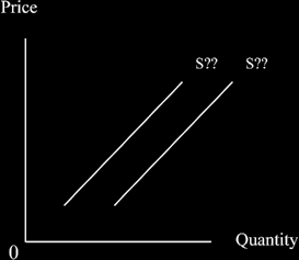
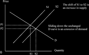
An increase in supply = the curve shifts downward and to the right (more is supplied at the unchanged price) - e.g., if labour productivity increases or someone finds a new cheap source of materials.
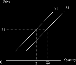
You will notice that the quantity supplied at the unchanged price P1 increases - well, that’s what an increase in supply does!
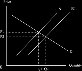
And if we put in a demand curve we can see both the equilibrium positions and work out that an increase in supply means a fall in price and an increase in the quantity purchased.
Time Periods And Supply
Three time periods matter:
· the very short run (VSR) (or “momentary supply”),
· the short run (SR) , and
· the long run (LR).
They have different slopes to their curves and different elasticities (more later!).
The very short run. This is defined as the time when no change can be made in any of the factors of produc- tion – the supply curve is vertical. Examples are the fruit and vegetables that appear in the wholesale market each day.
The short run.
This is defined as the period in which the variable factors can be altered but not the fixed factors, i.e. we can make some changes.
· Fixed factors = those that do not vary with output such as factory building, transport fleet, office staff, and the bill for heating and lighting the premises.
· Variable factors = those that vary directly with output such as raw materials, the energy used, the petrol in the trucks, and the wages of some unskilled workers who might be taken on when needed, perhaps part-time.
The supply curve we usually draw is the short run one. The long run
Is defined as the period when all factors can be varied i.e., the producer can do any changes s/he wants. This means a flatter curve, possibly even downward sloping sometimes.
How the supply curve can vary with the time period we are considering:
The flatter the curve, the more elastic it is (“quantity stretches more”). Producers will only make changes that help them produce more or reduce costs.
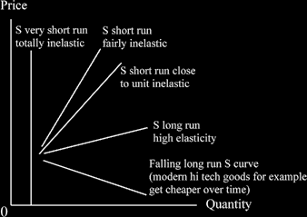
NOTE that all the curves are drawn on the one diagram; this means the scale is the same for all; if you draw each in a separate diagram, the flatter one (S long run) is not necessarily the most elastic, as the horizontal axis might be on a much wider scale. If this seems incomprehensible to you, Do Not Worry! Just remember to put them all on the same diagram.
Remember that you should practise drawing the diagrams regularly!
Increases and Extensions of Supply And Demand
We know that the word "increase" means a shift of the curve – but what about extensions? "Extensions" are movements along an existing curve.
Questions are often set to see if you know the difference between an ”increase” and an “extension”.
[A digression: if a line crosses two others, an increase in one curve always means an extension of the other! The diagram here shows that.
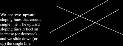
We see two upward sloping lines that cross a single line. The upward sloping lines reflect an increase (or decrease) and we slide down (or up) the single line.
For supply and demand:
With an increase in demand we slide up an unchanged supply curve.
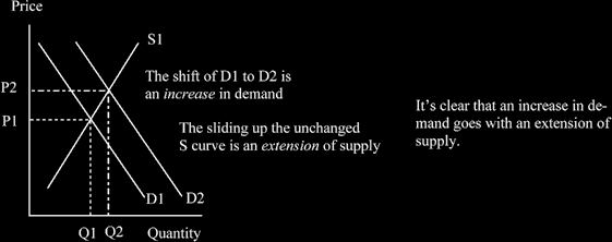
NOTE that we start on demand curve D1 and supply curve S1 to ascertain the equilibrium price and quantity; then we look at D2 to get the second equilibrium position.
Reminder: In economics, at this level we always start in equilibrium, then we alter something, and move to the new equilibrium position. We then compare the two equilibrium positions for the analysis.
And we can see an increase in supply goes with an extension of demand, as we slide down an unchanged demand curve:
Decreases and contractions of supply and demand
A decrease means a new curve, which shifts backwards; a contraction means sliding back along an un- changed curve.
A contraction of demand following a decrease in supply :
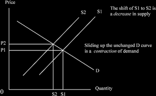
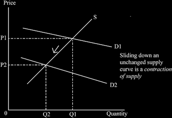
A contraction of supply following a decrease in demand:
Here is one of the hoary old trick questions. "Demand increases, so price rises. The rise in price means fewer can afford the good, so demand decreases and prices fall again." Do you agree with this statement?
Question: what do you think?
At first glance it might seem to make sense. But it is in fact false!
Why is it false? You draw the diagram now on a piece of paper. First increase the demand curve and you will see the price rise as we extend up the supply curve.
Then think about the new equilibrium. Why on earth should it change? It is an equilibrium position! That was why you learned the definition of equilibrium a little while ago - to be able to detect fallacies in argument.
This is a proposition in logic, designed to test if you really understand supply and demand. You should try to get the words “extension” and “increase” in to show you can use them properly and you definitely need a diagram.