| Home | Revision | A-Level | Economics | Managing the Economy | The Phillips curve |
The Phillips curve
What is it?
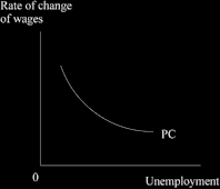
It is a curve showing the relationship between the level of unemployment and the rate of change of either wages or prices. It shows the trade-off between unemployment and inflation. The original version was wages and unemployment; later this was changed to prices and unemployment.
What does it look like?
The newer version, relating the level of unemployment to the rate of inflation is the one we now tend to use.
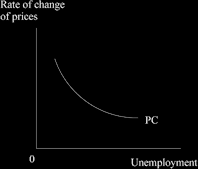
Trace the trade-off! As we slide up the curve, a country can reduce the level of unemployment by accepting an increase in the inflation rate.
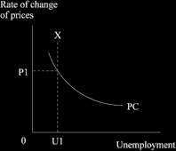
Below is the original Phillips Curve which related the level of unemployment to the rate of inflation. Notice the different label on the vertical axis – it used to read “wages” but we now use “prices”.
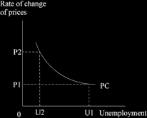
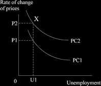
The Phillips Curve was very popular in the 1960s and 1970s as governments sort to intervene and control the economy, using the Phillips Curve approach. They lowered the rate of unemployment by expanding the economy and accepted the slightly higher rate of inflation; they moved from U1 to U2, and from P1 to P2 in the diagram below.
BUT! It turned out to be useful in the short term only.
Eventually people, workers and unions woke up to what was happening, and saw that inflation had increased and demanded more wages – which then pushed up inflation further. Milton Friedman pointed it out in “the expectations augmented Phillips curve”. The rate of inflation suddenly jumped up to “X” in the diagram below, rather than staying at P1.
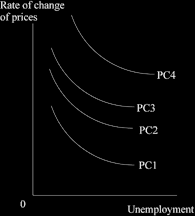
This was a shock and it was not clear what was going on. Eventually we realised that what was happening was that the whole Phillips Curve was drifting up and outwards as
workers and unions caught on. Each outer curve represents people expecting a higher and higher rate of inflation.
No longer are we on the original Phillips Curve, nor can we easily get back to it. We can end up with the old level of unemployment and much higher inflation!
Then it got worse! The Phillips Curve continued to drift out over time as the process continued, like this:
It was a time of dismay. Inflation got higher and higher, reaching an alarming 26.9 per cent a year in the UK in the month of August 1975. The level of unemployment was not low and a new term was invented: “stagflation”, where we suffered stagnation and inflation.
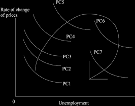
When the data were in after several years’ experience, we discovered what had been happening. After the government led the economy to slide up the Phillips Curve, people were only fooled for a time. Once they realised what was going on, they upped their wage demands to take account of the price rises that they expected. And their expectation kept rising with the rate of inflation. It took may years of tight monetary policy before we managed to break people’s expectations about high future price rises. These expectations, when graphed in the form of the data that made up the Phillips Curve, revealed that it went up, then out and round, and finally came down again.
Unemployment and the fear of redundancy eventually forced workers to accept smaller wage increases which led to some fall in the rate of inflation and as people learned to expect smaller price rises, they asked for smaller pay increases, then eventually were just happy to be in a job at all. This seems to have been what caused the curve to drift back and down.
But it was a most painful process, involving very high rates of unemployment, suffering, and social unrest over some years. This is what it looked like.
The end result of using the Phillips Curve and accepting a bit of inflation to reduce unemployment was felt to be unacceptable. The price is too high! We no longer want to use the short term Phillips Curve for policy purposes, because it eventually leads to higher inflation and then requires several years’ harsh policies to put us back on track.
Instead, we now tend to look for “the non-accelerating inflation rate of unemployment” or NAIRU.
This is the point on the Phillips Curve where we can exist without forcing inflation to increase. It is hard to judge exactly where it is and it can alter as people’s attitudes and behaviour change. It is believed that it may currently be between 3.5 per cent and 5.5 per cent of unemployment.
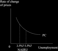
NAIRU occurs where the aggregate demand for labour = the aggregate supply of labour. If unemployment is reduced below NAIRU, wages may start to rise, costs increase, and inflation accelerates.
What can change NAIRU? We would like it to be smaller.
More flexible labour markets helps. If wages are able to adjust in a downward direction (as the demand for particular type of workers falls) it reduces the average wage rate while allowing needed adjustments.
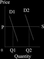
Anything that leads to a more efficient working of the whole micro economy helps reduce NAIRU. For instance, removing bottlenecks in certain types of workers, or kinds of machinery, or particular raw materials reduces NAIRU. If we can do this, we will have a more elastic supply curve so that demand can increase, we can extend along the supply curve, and prices will not increase much.
If it were perfectly elastic, people could buy more without forcing the price up at all, as in the microeconomic diagram below which represents the supply of any needed raw material.