| Home | Revision | A-Level | Economics | Managing the Economy | Macroeconomic policy – What.. |
Macroeconomic policy – What the government does or tries to do
Recall the economic goals.
As you know, there are about ten major economic goals for all countries (the main four goals for many governments are asterisked, but each government chooses for itself).
Their actual order depends on the priorities of the government of the day.
• Resource allocation.
• Economic growth.*
• Standard of living.
• Income distribution.
• Inflation.*
• Unemployment.*
• Balance of payments.*
• Value of the currency internationally.
• Protecting the environment.
• Avoiding unwanted fluctuations in any of the above.
Even if a country has no policy on some of them, the issues do not go away!
NOTE: this is a useful list to remember. Any event can be analysed using this list as a framework for thinking. For example, the effects of an earthquake; or a new government after a general election; or a new tax being introduced. Any such event will have an
effect on some, perhaps nearly all, of these goals. If you learn the goals and think of them, it can save you overlooking valuable points when preparing your essays or answering questions in the exam room.
There are trade offs between goals; we cannot get them all at once – e.g., if the economy is growing fast it usually means:
• Higher prices.
• The balance of payments deteriorates (imports increase).
• Income distribution widens.
• The currency may strengthen (if people around the world believe the growth is permanent and the economy will continue to be dynamic).
• Or it may weaken (if people believe the economy is out of control and inflation will continue).
• The environmental situation may worsen, e.g., there might be more air and water pollution, or traffic delays could be longer.
The main question for economic policy is where do we want the equilibrium level of
GDP to be?
It is the government’s choice as to where it wants it – but we may not get there! Economic policy is the effort of trying to get from where we actually are to where the government wants to get.
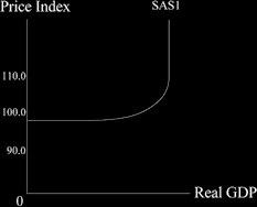
Let’s look at a new diagram that can show the level of national income as a continuum from dire slump to mega boom.
When output is zero (at the left hand end of the Real GDP axis) we can start to produce without any inflation because there is a huge amount of surplus capacity of both
machines and workers. This means the aggregate short run supply curve is a horizontal line.
When we run out of capacity and have no spare machines or workers, (towards the right hand end of the Real GDP axis) there can be no short term increase in output and if demand increases further prices must simply rise. This means the aggregate short run supply curve becomes a vertical line.
As we move from the horizontal to the vertical segment, there will be a gradual increase in the slope, as we start to run short of a few machines or types of workers, but not all.
So the aggregate supply curve looks like this.
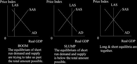
We can use this overall SAS curve to look at the three basic areas the economy can be in: slump, boom, or just about right. I know this sounds like the Goldilocks theory of economics but it is a fair description. Take a look at each aggregate demand curve in the diagram below.
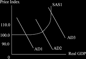
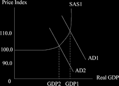
AD1 = slump or depression: the Keynesian World
Here we see: underused land, labour and capital (unemployment being the most obvious); low growth rates; and a low rate of inflation. We are losing potential GDP that we could enjoy.
Q. When we are here, what do we wish to do?
A. Increase output, reduce unemployment, and boost growth.
The remedy to adopt is to increase aggregate demand! This will slide us out along the SAS curve and increase the level of GDP, so employment and output rise. We can achieve this without any danger of inflation as we are well to the left of the diagram (see the diagram below).
• We can best use fiscal policy for this – reducing tax will increase consumption or investment quickly and easily.
• This is a basic Keynesian policy and it works when we are around AD1.
• Monetary policy may not work well in a slump, so it is perhaps best avoided. We cannot force people to borrow and consume, or borrow and invest, just by lowering interest rates.
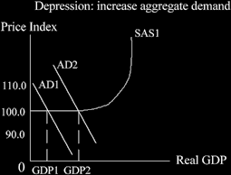
As demand increases, we can increase output but without suffering from inflation.
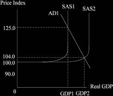
Now look at the original AD2 in the second diagram back = the usual situation we are in. (We use it in the diagram below).
We see reasonably good levels of output, growth, inflation and unemployment, with perhaps a small deficit on the current account in the balance of payments.
Q. What might we want to do?
Maybe nothing – the government might accept that it is OK to be where we are.
Or they may try to “fine tune” the economy i.e., to alter GDP a little bit up or down. The government might fear that a boom is in the offing or a slump is likely to occur and may wish to try to offset it. If the government thinks exports might slump, the government might wish to increase investment to offset this, and thereby maintain the level of aggregate demand.
If the government decides toincrease aggregate demand, it can increase the level of GDP (= growth) and reduce unemployment, - but at the cost of higher prices as we slide out along the SAS curve.
If the government decides toreduce aggregate demand, it can lower the level of GDP and reduce the rate of inflation - but at the cost of higher unemployment, as we slide back along the SAS curve.
The government may use fiscal or monetary policy (or both) should it wish to adopt either of the above changes; and either policy should work.
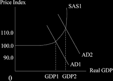
The original AD3 in the fourth diagram back - full employment = the Monetarists’
world
We would be experiencing low levels of unemployment, higher inflation, decent growth, and probably a deficit on balance of payments.
Q. What might we want to do?
The government could just accept it as being desirable.
It is more likely that they would decide to reduce the level of demand in order to pull the economy back. The reduced demand would help to tackle inflation and reduce the degree of over-full employment. In the diagram below, you can see inflation reduces from 125.0 to 108.5, and GDP falls slightly, taking the heat out of the system.
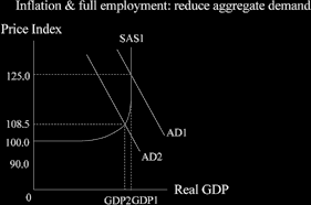
At this extreme right hand of SAS curve, monetary policy can be used easily – reducing the money supply will reduce inflation.
If we want more growth when we are at full capacity, in the short term we can do little. We cannot increase aggregate demand to give us a higher GDP because we are already at the limit. An increase in AD would merely lead to a further price increase.
So we have to tackle the supply side and think longer term. In the long run we can try to push the aggregate supply out to the right – to get more growth.
We shall look at the supply side controversy later in more detail.
You can also use our original diagrams to show the boom, slump and “got it right” positions, but I personally find them less illuminating as there is no visible portion where the economy is gradually running out and prices are starting to rise then accelerate.
TIME TO PLAY! MOVE THE AGGREGATE DEMAND CURVE AROUND!
Start in a recession - you draw a diagram of a slump now, using the short run aggregate supply curve below and adding the aggregate demand curve.

Q. What happens if the government hires and pays a lot of workers to dig holes and fill them in? Draw this effect on the diagram. Which part of aggregate demand increases?
Q. What happens if government reduces income tax substantially? Again, draw it in a diagram. Which part of aggregate demand increases?
Q. What happens if government increases pensions a lot? Which part of aggregate demand increases?
Q. What happens if the Monetary Policy Committee reduces the interest rate? Which part of aggregate demand increases?
You can repeat the exercise, asking the same questions, for the AD2 and AD3 positions.
You benefit a lot from playing around like this, asking questions, and using the diagram to help you answer them. That is really what a lot of exam questions are seeing if you
can do!