| Home | Revision | A-Level | Economics | Managing the Economy | Altering the level of.. |
Altering the level of national income
A change in the level of GDP must be a result of either a change in aggregate demand or in aggregate supply or perhaps in both, because these two determine where the level of GDP actually is.
How do we show an increase in demand?
We push out the aggregate demand curve, just as we would in the micro diagram.
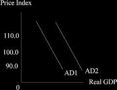
Q. What can increase aggregate demand? (which of course = C + I + G + X - M)
A. Anything that affects C or I or G or X or M can change the aggregate demand curve! Examples:
• An increased desire to consume more (an increase in C).
• An increase in government spending (an increase in G).
• An increase in export sales (an increase in X).
How do we show an increase in SAS?
Push it out to the right = more is supplied at any given price level.
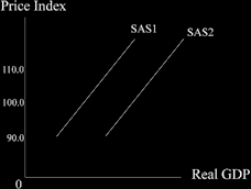
What can push out the SAS curve to the right?
• An increase in the quantity of factors of production.
• Better quality of factors.
• Better ways of using or combining the factors (L, N, K) + R.
Some things that can push out the SAS curve:
• New technology is introduced (= better K).
• Investment increases (= more K).
• Productivity increases (perhaps workers work harder, or managers try harder, take new training courses, or work longer hours).
• More migrant workers enter the UK (= an increase in the supply of N).
• An increase in the hours worked by labour (= an increase in the supply of N).
• Better education or health of workers and managers (= better quality “N”).
• An increase in Direct Foreign Investment from abroad (= more K; and possibly better
K).
• A reduction in taxes placed on firms and companies.
Changing the level of equilibrium
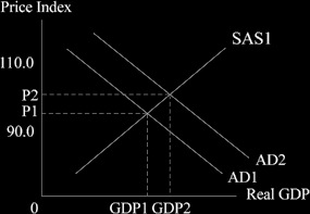
We put the two aggregate curves together to get equilibrium and then shift one of them, just like in microeconomics. Let’s increase demand! Maybe exports went up, the “X” bit of total aggregate demand C + I =G + X - M
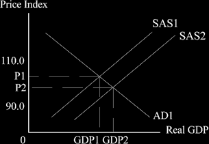
When aggregate demand increases we can see that output expands from GDP1 to GDP2 and the general price level rises from P1 to P2. The increase in GDP is accompanied by a slightly higher rate of inflation.
Now let’s increase supply!
When we increase the short run aggregate supply curve – perhaps a sudden increase in immigration has added to the labour supply and pressured wages down a little – we can see that again GDP increases, but this time the price level falls, from P1 to P2.
The long run aggregate supply curve (LAS)
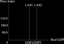
The long run aggregate supply curve is vertical – it shows us what the maximum output can be at the time we are examining. It usually drifts out to the right over time, as productive capacity increases. This is because of things like a greater capital supply, better technology, better management, improved skills and training of labour – all the things that go into the production function in fact.
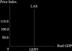
The movement to the right of the LAS is often called “the underlaying rate of growth”, showing us what we could manage if all our capacity were in use. You can see this in the diagram below.
The fun starts when we combine the short and long run curves together
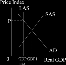
In this diagram we can see that the short run equilibrium position is to the left of the maximum possible. Now this we can manage easily!
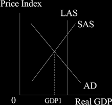
What we cannot do is get a short term equilibrium greater than we can manage! The attempt to do so is shown in the diagram below.
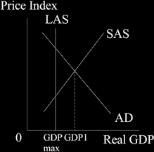
Clearly it is impossible to produce more than the most we are able to produce but that it was the economy is trying to do!
So what is going to happen?
We are experiencing boom conditions, with a lot of excess aggregate demand and all that can happen is that prices will rise – and rise quite a lot too! The demand curve AD intersects the long run supply curve (the maximum output possible) and we cannot get to GDP1 at all. What we do find is a level of national income GDP max and a price level as high as P.
